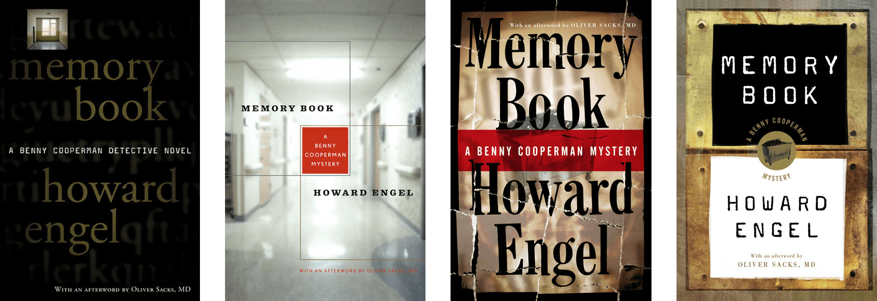
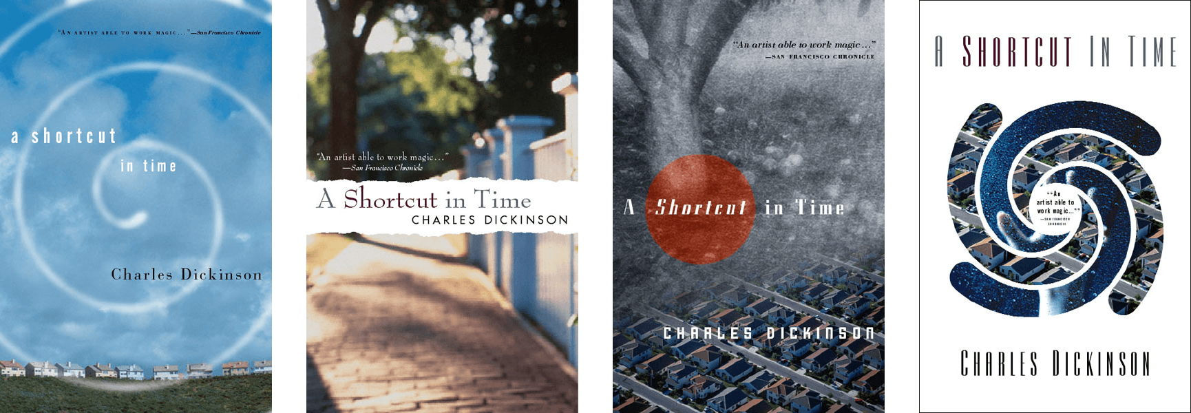
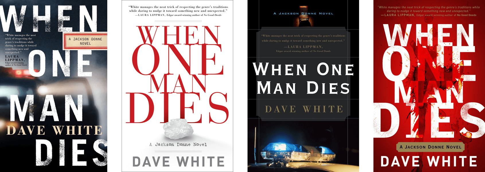
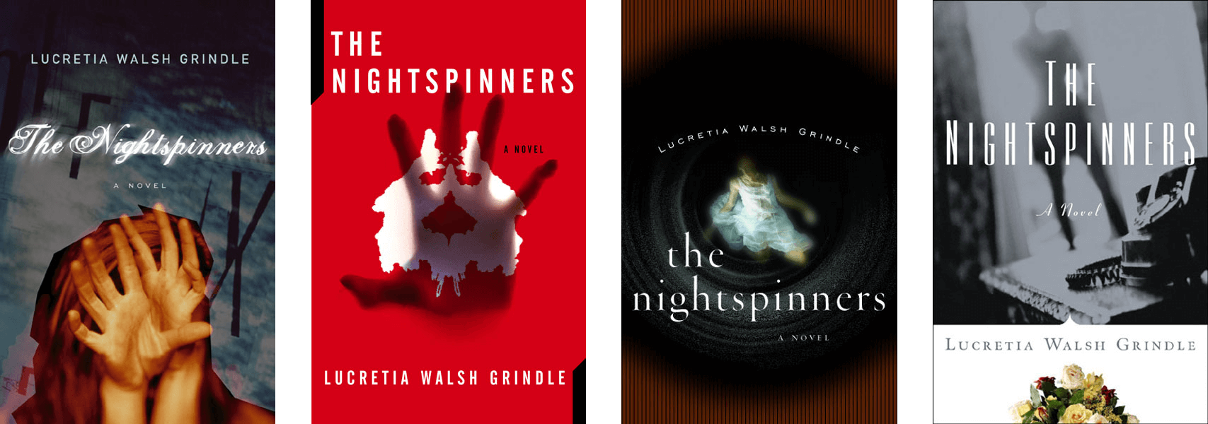
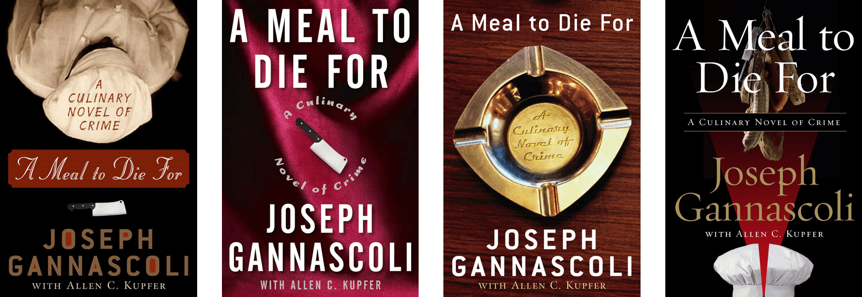
I reviewed many portfolios during my time as an art director in book publishing. The common wisdom for freelance designers was (and curiously, still is) to show up with only their very best work—a maximum of perhaps 12-15 pieces.
However, I always felt this type of aggressively edited “highlight reel” of one’s work was not able to provide much of the insight I was looking for—
- Can this designer provide a selection of strong designs to get an assignment off to it’s best start?
- Do they possess the range/poise to comfortably change direction if needed?
- Can they initiate solutions to reconcile any potentially contrasting in-house feedback?
- Typically a designer’s strongest pieces favor work created under fairly ideal circumstances (a great title, excellent photography, etc.), but how would they fare with a more obscure title? Or a nonexistent art budget? Or with extensive cover copy?
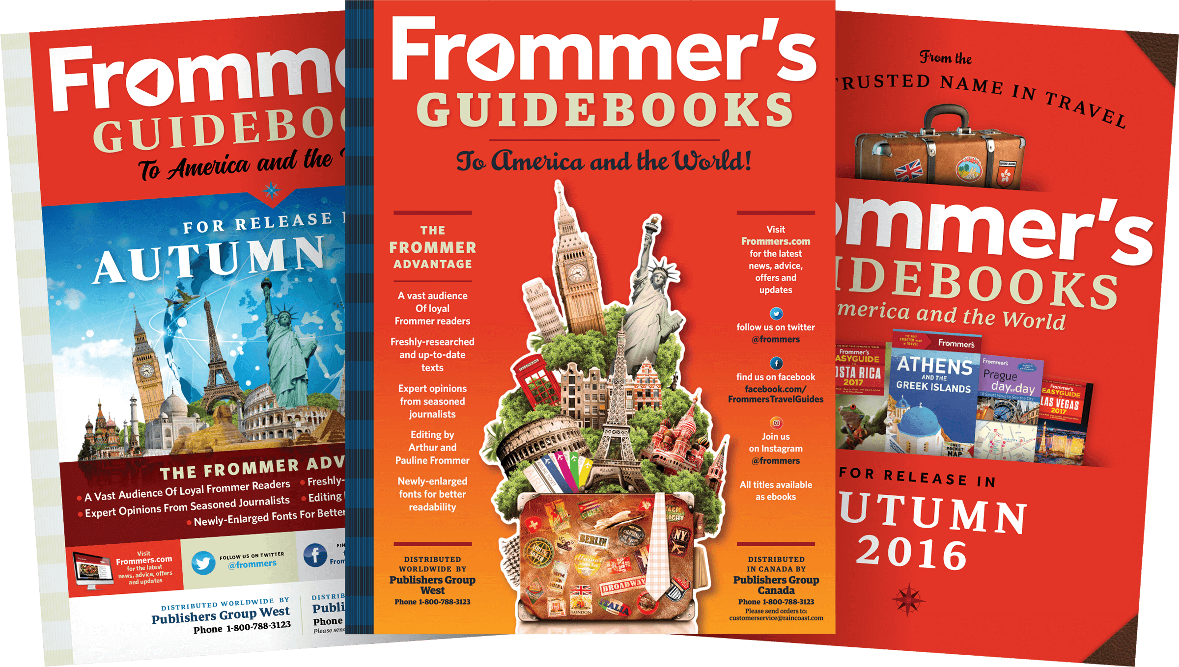
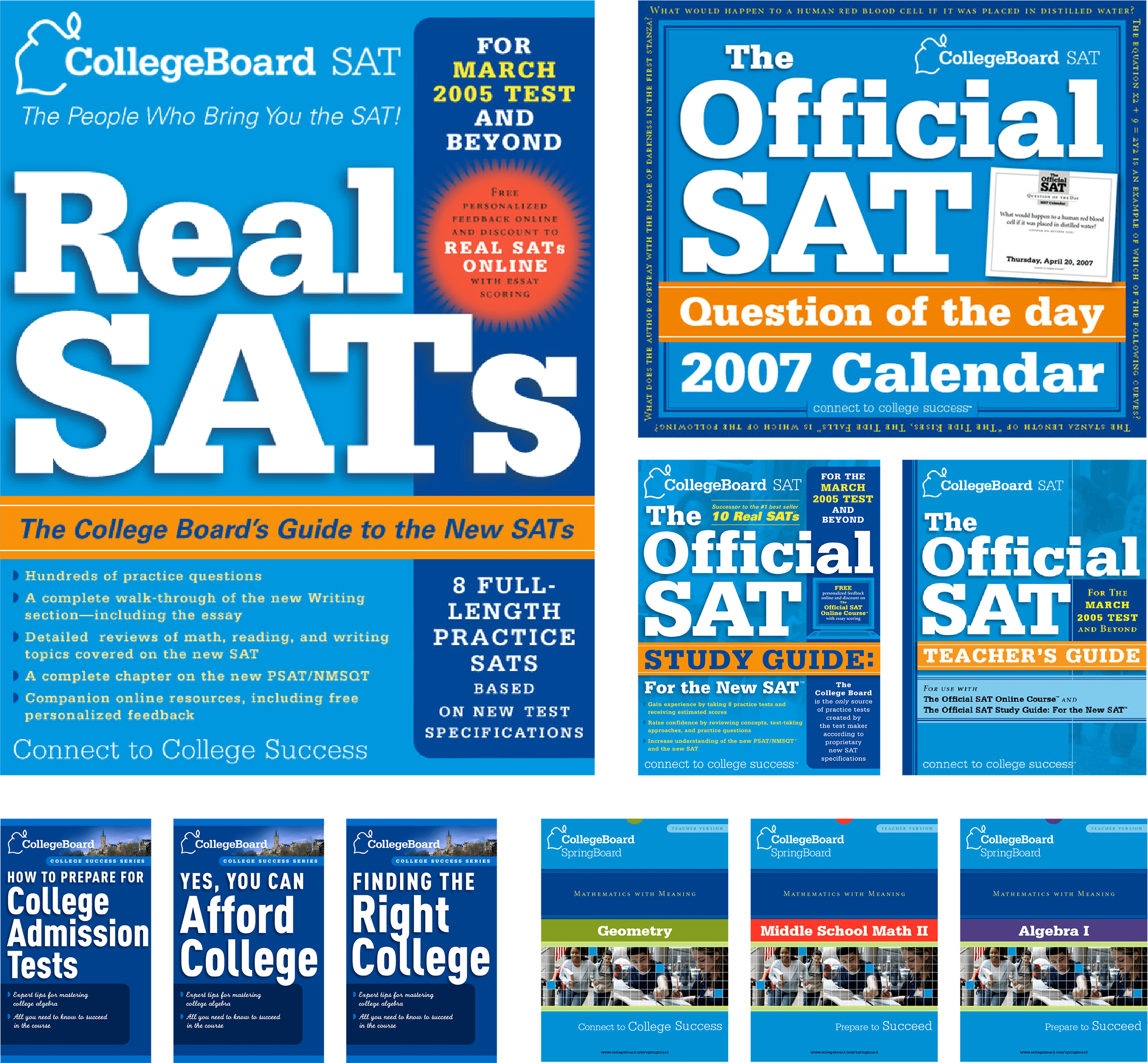
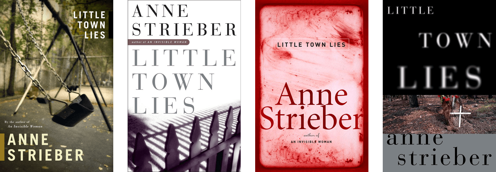
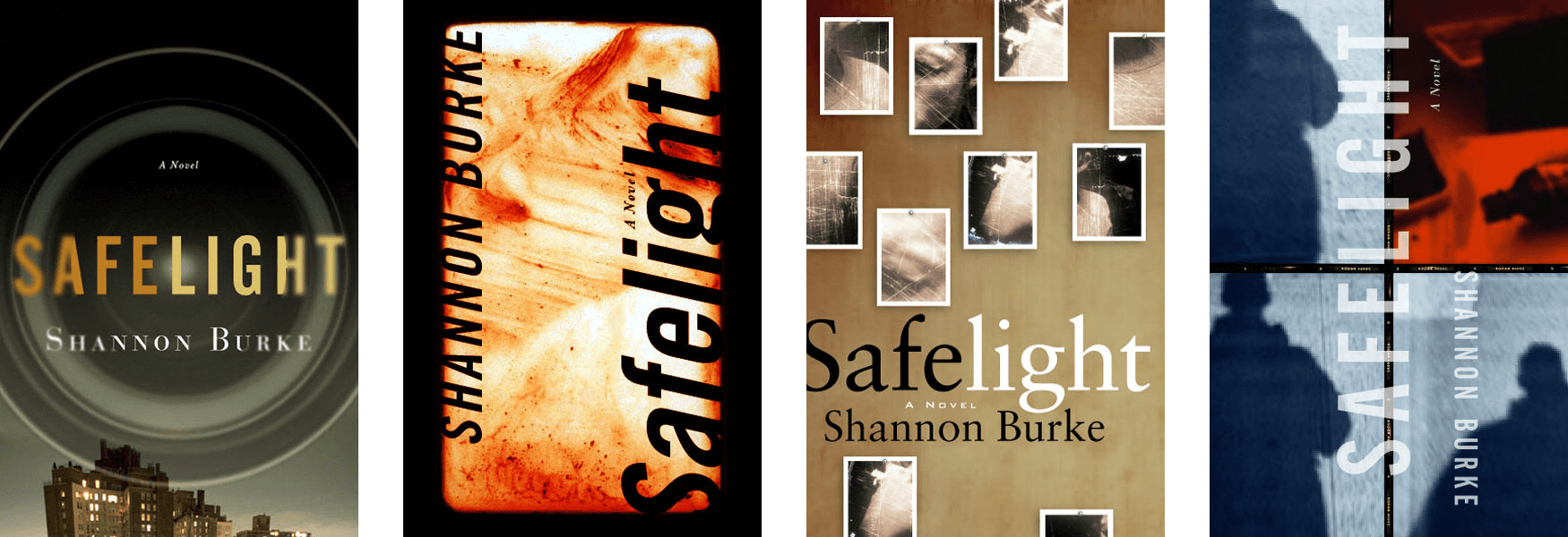
Basic questions like these were difficult to address by looking at just a handful of carefully selected images. In that spirit, I hope you find it useful to get a much broader—less edited—look at my everyday work beginning in the gallery just below (also, please be sure to see the original sets of comps shown for many assignments).

